Rebuilding Confidence in Condom Choice: Redesigning Durex’s Product Finder Tool
TL:DR
The Durex condom quiz didn’t work. It was confusing to navigate and assumed users knew aboot the product range already. It was a missed opportunity to educate and convert
I led the UX design of a new tool, balancing the brand’s product architecture with an experience design for users with real insight and no assumptions.
The result was an effective new tool, live in 20 markets that supported the brand by being user-focussed.
Conversion rate: ↑ from 0.5% → 4.6% (8x increase)
Revenue: ↑ from £2.6k/month → £12.7k/month, now 11% of site revenue
Bounce rate: ↓ from 59% → 7%
Completion rate: ↑ from 66% → 76%, despite more steps in the new design
Pageviews: ↑ from 6.4% → 19.8% of total site traffic

The existing tool - little engagement with the filter options that were intended to help users narrow down their choices. Difficult to identify which options are selected.
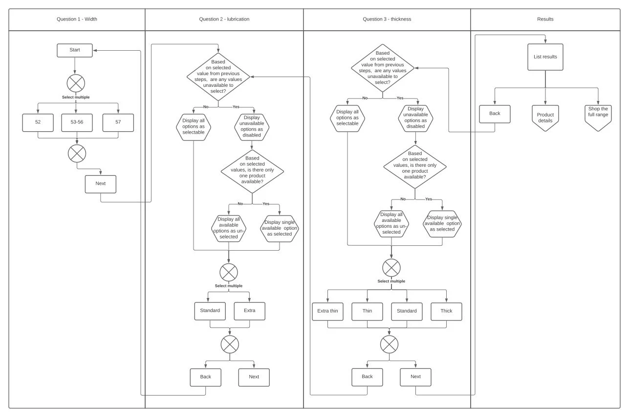
Mapping the flow of the quiz taking into account the brand product architecture and the product feature matrix, to ensure we don’t present zero options to the user.
1. Overview
Durex, a global sexual wellness brand, introduced a new product range with a focus on size as the key decision-making factor. To support this shift, they needed a product selection tool that would guide users effectively through the range and drive purchase confidence — but the existing version was underperforming in both engagement and sales.
2. Users & Audience
The tool was designed primarily for men looking to find the right condom for their preferred sexual experience. It needed to support ease of choice, remove confusion, and help users feel more confident in their selection — especially for those unfamiliar with the updated range.
3. Problem Statement
While the tool had been updated to reflect the new “size-first” positioning, it was failing to deliver on its goals. User engagement was low, completion rates were falling, and conversions were minimal. The experience assumed users already understood the product structure, and it allowed combinations that led to zero results — creating frustration and drop-off. The existing tool lacked integration with purchase options, making it a missed opportunity for conversion.
4. My role
As lead UX designer, I worked closely with the website owner and brand team to define the best experience. My role was to translate a complex product strategy into a clear, intuitive, and high-performing digital journey.
5. Constraints
Condoms are classified as medical devices, so all website content — including interactive tools — required internal and external regulatory review. The logic of the tool had to be documented and communicated clearly for risk assessment, which added complexity to design decisions and stakeholder sign-off.
6. Process
I began by analysing insights from previous versions of the tool, including click tracking data. I mapped out the problem and opportunity space, then developed logic flows and journey maps to simplify product selection while preventing user error.
Through iterative wireframes and final UI design, I focused on making the quiz format engaging, supportive, and self-guiding. I collaborated with the medical team at every stage to ensure full compliance and to avoid delays at the review stage. Final designs were user-tested to validate clarity and effectiveness before development.
7. Outcomes & Learnings
Results:
Conversion rate: ↑ from 0.5% → 4.6% (8x increase)
Revenue: ↑ from £2.6k/month → £12.7k/month, now 11% of site revenue
Bounce rate: ↓ from 59% → 7%
Completion rate: ↑ from 66% → 76%, despite more steps in the new design
Pageviews: ↑ from 6.4% → 19.8% of total site traffic
Learnings:
This project demonstrated how regulatory constraints don’t have to stifle innovation — with early collaboration and clear communication, we delivered a compliant, commercially successful tool that genuinely improved user experience.
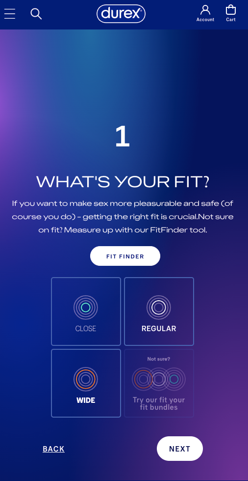
You can explore the live condom quiz on most Durex websites around the world: