Designing Empathy: Nurofen’s Digital Platform to Spotlight the Gender Pain Gap
TL:DR
Omni-channel campaign to raise awareness of the Gender Pain Gap, and give women tools to discus their pain and be heard
I led the digital experience design, collaborating with the marketing agency, brand and tech teams
Outcomes:
high engagement with content with 72% of users scrolling 75% of the page
16% conversion to download of pain tracker pdf.
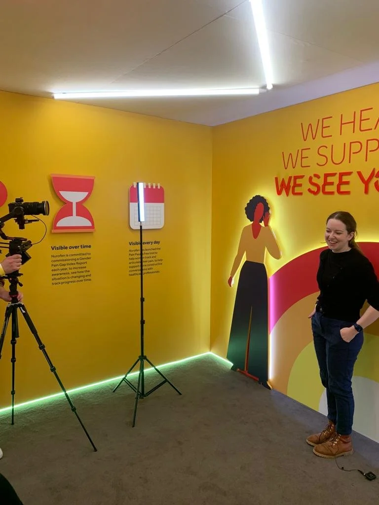
Being interviewed about my role on the project and my personal experience with the Gender Pain Gap
The physical twin to our digital experience
A rare treat, seeing our work on a 3ft display
“I’ve struggled with endometriosis for over a decade. My pain was dismissed by healthcare professionals for years, until the day I needed emergency surgery. Working on a project with such an important message was a huge source of pride for me.”
1. Overview
Nurofen, a leading ibuprofen brand, launched See My Pain, a campaign to raise awareness of the gender pain gap — the systemic disparity in how women's pain is perceived and treated. The goal was to drive public engagement and understanding of the issue and give women tools to support them in conversations with healthcare professionals, through a high-impact digital experience hosted on Nurofen’s owned web platform.
2. Users & Audience
The digital experience was designed for the general public. While the campaign focused on the lived experiences of women, the aim was to educate and engage people of all genders around the unequal treatment women often receive in pain care.
3. Problem Statement
Research commissioned by Nurofen revealed that over half of women in the UK felt their pain had been ignored or dismissed. See My Pain was launched to bring visibility to this issue, challenge existing biases, and encourage more equitable conversations around pain — with the website acting as a central storytelling and education hub.
4. My role
I led the creation of the digital experience. This included managing the UX/UI team and shaping both the strategy and user journey for the website. I worked closely with agency creatives, the media team, and brand stakeholders to ensure digital touchpoints supported the wider campaign narrative. I also liaised with internal tech teams to ensure feasibility within existing platform constraints.
5. Project constraints
The project ran on a fixed five-month timeline with no flexibility on launch. As a healthcare brand, Nurofen’s digital content required strict regulatory sign-off from internal and external medical teams. Technically, the site had to be built using Nurofen’s existing internal CMS, ruling out third-party development. These constraints meant some creative concepts had to be adapted, requiring close collaboration and negotiation with the agency.
6. Process
We began by expanding the original brief in partnership with the agency, mapping user journeys across earned, paid, and offline channels. I conducted stakeholder interviews to understand goals and expectations, which informed a detailed and realistic design brief.
Wireflows were developed to visualise user pathways and explore how various content elements could support multi-layered storytelling. I led ideation for how to make the most of our owned channel’s capabilities, particularly around engagement and depth. When the agency’s initial creative concepts proved unfeasible, I guided the team in crafting viable alternatives and oversaw the final UI design to ensure alignment with both brand and technical requirements.
7. Outcomes & Learnings
Key results from the experience:
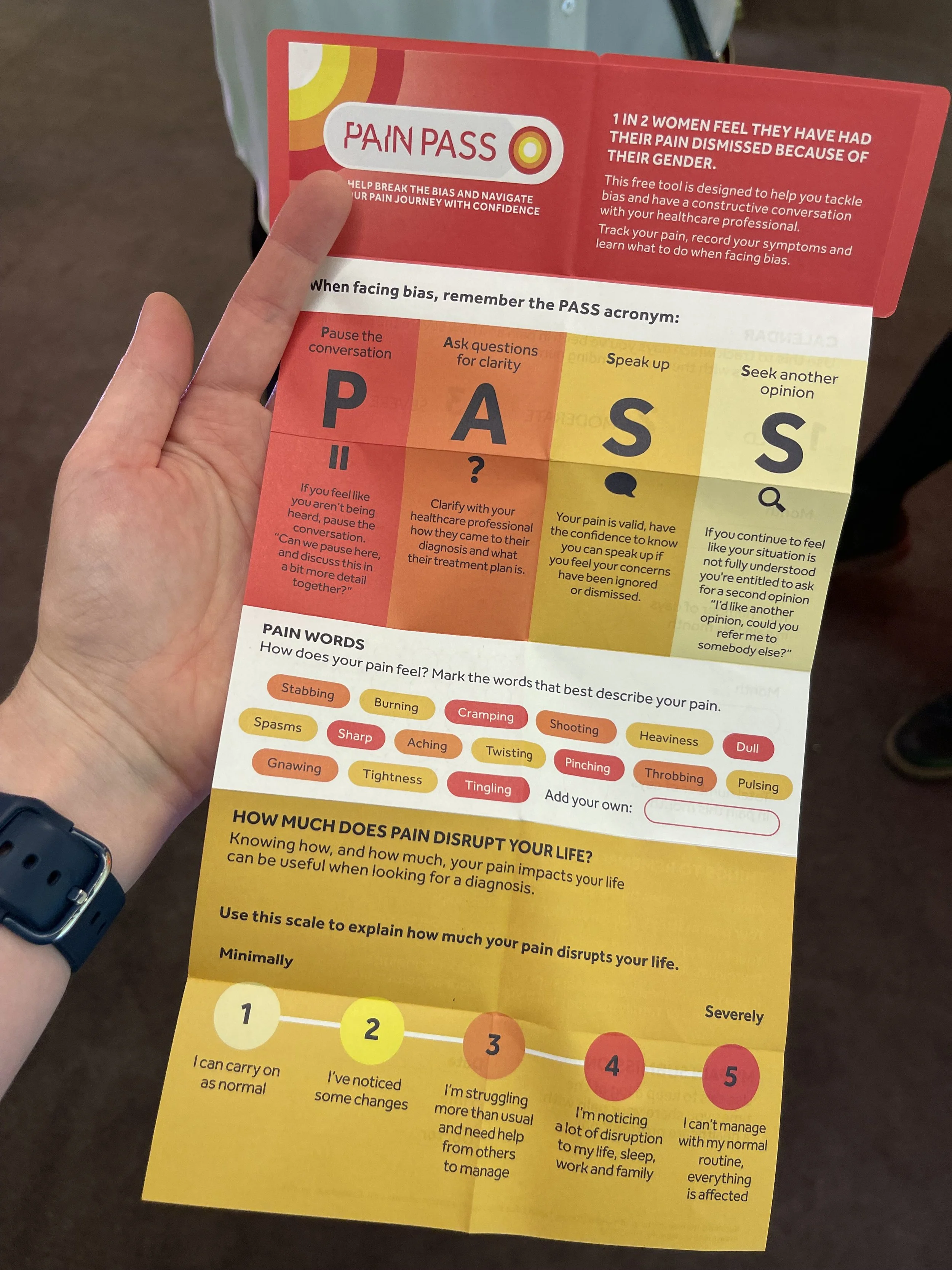
The campaign site attracted over 60,000 active users during its four-month run. Engagement levels were strong, with an average of 2.4 page views per user — notably higher than the site's baseline of 1.8. One of the key content pieces, the Pain Pass page, had 72% of users scrolling at least 75% of the page, indicating high content engagement.
Downloads also performed well: 16% of users who viewed downloadable content went on to download it (12,485 downloads from 74,498 views). In-page navigation tools were effective, with 24% of users interacting with anchor links — helping them move deeper into content more efficiently.
Personal learning:
This project reinforced the importance of transparent, collaborative communication when managing cross-functional constraints. I learned how to say “no” to unfeasible ideas in a constructive way — maintaining trust while guiding teams toward solutions that balanced ambition with reality.

