Optimising form submission: an end to end test
TL:DR
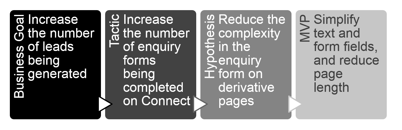
Application of Lean UX methodology - from business goal to test outcome
Analysis of existing issues and opportunities to form hypothesis
MVP tested live - outcome was form conversion increase from 6.7% to 10.6%. A 57% increase in conversion.
Initial Problem
Hitachi Capital have a new leasing website which is still in it’s infancy. The website started as an MVP and is finding it’s feet, as are the squad in running a ‘BAU’ agile approach to delivery. The initial request from a business stakeholder was to change the copy on the lead capture CTA of the vehicle pages, in order to increase the number of customers who convert to a lead.
After discussion with the product owner, I suggested we take broader view of the problem. At the time only 6.74% of users who opened the lead capture modal then went on to complete and submit the form.
Following the Lean UX methodology, I worked with the Product Owner and business stakeholder to identify the relevant business goal and tactic which we would be aiming to add value to.

Review and hypothesis
I conducted a heuristic review of the lead capture journey, starting from the initial vehicle page through to the confirmation screen. I compared it to similar experiences on competitor websites as well as websites that demonstrate best practice. I reviewed it with colleagues in the tech & design teams, as well as those in the business.
I identified several key areas which could be contributing to usability issues and deterring users from competing the forms. This included:
ambiguous messaging and CTAs
unnecessary text taking up space and pushing the actual form fields and Submit button too far down.
too much content split across two columns, creating a distraction layout for scanning
unnecessary fields (which aren’t used according to previous form submissions)
live chat window obscuring the button
I proposed a hypothesis to test:
Outcomes of test
I created wireframes of a simplified form layout. I collaborated with the Product Owner and business stakeholders to agree the content changes.
I worked with the squad to create a user story, and ensure it was prioritised for the next sprint. A month after the release I compared the form conversion for a 4 week period before and after the update. The percentage of users opening the form and then submitting the form went from 6.74% to 10.6%.
Limitations and next steps
Whilst this improvement is a good step forwards in improving conversion, there are limitations:
This form is at the end of the conversion funnel journey, so an improvement on conversion at this point will impact a small number of the original users accessing the website. It would be useful to explore opportunities at the beginning of the journey as well.
There is potential to introduce a lead capture opportunity at an earlier point in the vehicle search journey.
Although there has been an improvement in conversion, this stage in the journey would benefit from qualitative testing, to understand not just what users are (or are not) doing, but why they are doing it.