Starting from scratch: a greenfield car leasing website
TL:DR
Goal - to build and brand new website, initially for business customers then for consumers, to browse car leasing and customise choices.
My role was to lead the UX team in a hands-on capacity, embedded in a scrum model with disciplinary squads.
The outcome was a sophisticated experience managing complex choices, withs lick integration with the back end.
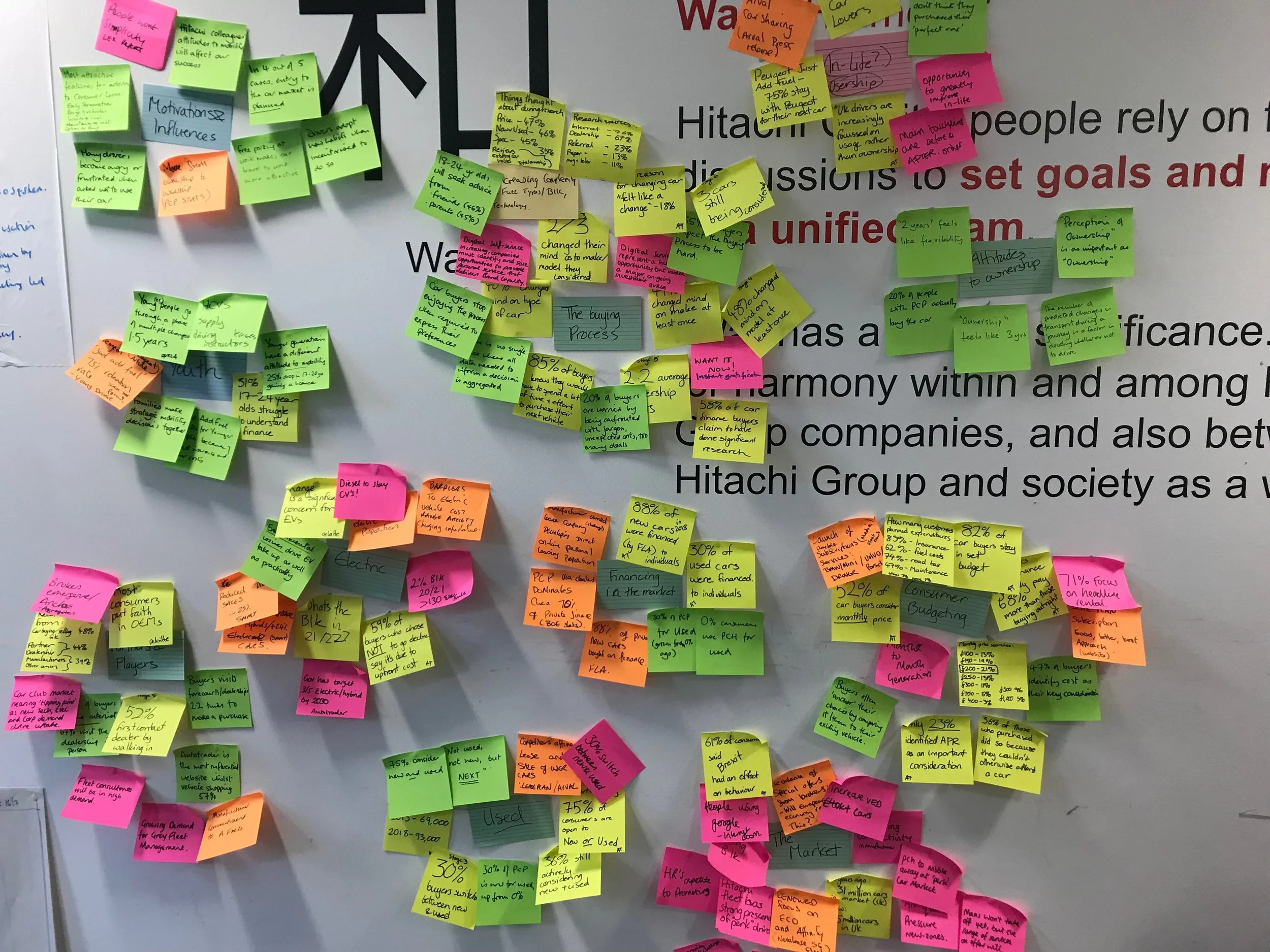
I facilitated discovery workshops to elicit key information from experience SMEs in the business teams.
The brief
The Vehicle Solutions function within Hitachi Capital are undergoing a significant transformation. They’re replacing legacy systems with a new customer leasing and vehicle management tool. This provides an opportunity to drastically increase the functionality and usability of the digital customer experiences. I was brought into the business to lead a small team in the user experience design on a new search and configure journey for personal and business leasing, and a redesign of the existing website to integrate the dynamic quoting journey with existing brochureware content.
The final sitemap had to be adapted to suit the technology framework, so I created an approach to try and simplify a complex architecture, making it easier for the team to have a shared understanding.
The challenges
The project, like many other’s before it, had a few challenges which needed to be managed
The initial goal was to build an experience for a corporate customer business car leasing experience, but the requirements changed mid way through the build, and it had to be re purposed as a public facing website. This meant that the website had to become a blend of Angular and CMS, retrofitted from the original architecture.
The organisation didn’t have an existing UI library or style guides suitable for a complex digital experience, so this had to be created in tandem with the experience design and build.
The deadlines were ambitious. Areas of the experience which were initially considered to be ‘first drafts’ were quickly becoming the final version for an MVP launch.
An example of working through the detailed journey flows for various site features.
Working with a new team
One of the first steps was to raise the profile of user centred design as an approach to software development, within the IT function and business stakeholders. Demonstrating the value and engaging stakeholders in the design process helped to get buy in. I created a project UX strategy and shared with stakeholders, to demonstrate the way that thoughtful design aligns back to the desired business outcomes.
Developing clear channels of communication with the Product Owner, BA, and development team was vital given the fast pace of delivery and challenges around scope. Quick turnaround of designs into delivery was made possible because I had fostered a good understanding of the approach with the team, so everyone understood the goals. There were many difficult priority decision to be made, and I had a key role in helping the PO understand the impacts of features being in or out of scope. For the many ideas that couldn’t be delivered in the MVP product, ensured that the thinking was captured to create a detailed backlog for future releases. long term iteration which will be to adapt to the changes in market place.

Initial designs for the homepage search and browse layouts.
The design approach
Working within the squad’s defined RRPD agile process, I created a flexible way of working for the UX team, which ensured we matched their velocity. I used workshops throughout the process to explore approaches and get input from colleagues with first hand experience of our products and our users and their purchase journey. We followed an Inception, Design, and Elaboration process, tackling Epics and feeding the designs into the squad for build. I set up regular sessions with stakeholders, to get quick feedback and ensure fast turn around of designs.
The design approach was focused on a thorough understanding of existing research materials from customer surveys, regular competitor & market analysis and best practice, and a clear understanding of our products and business goals. We followed a simple approach of Think, Evolve, Learn. This constituted: initial sketches based on existing knowledge, workshop outputs, and collaborative team feedback; guerrilla testing with colleagues who varied in their knowledge and skill of the products; and iteration of the designs.
Outcomes and next steps
As this was untested technology for us, we used a soft launch to put the website live. We deliberately reduced PPC traffic in order to test stability, and get initial feedback.
The first few sprints post launch have been focussed on performance, reducing page load times from an average of 19 seconds to an average of 9. This is still longer than ideal, and work is continuing to balance the page load times with the live look up of data.
Throughout development I had been creating a backlog of ideas to test, and features to enhance, that hadn’t made the original scope. I have facilitated with key stakeholders and the Product Owner to identify the key points of the journey for enhancement next, including simplifying forms and search results.